
chartjsでラインチャート(折れ線グラフ)を作った。
ラインのポイント調整やY軸のメモリ幅調整を実装したので、残しておく。
確認環境
- macOS 13.2
- docker desktop 4.16.2
- vue 3.2.45
- chartjs 2.9.4
- vue-chartjs 3.5.1
ラインチャートの作り方
canvasタグにラインチャートを描画する
data, optionsをそれぞれ宣言して、new Chartに()に渡す
template
<div style="position: relative; width: 80vw; height: 50vh">
    <canvas id="canvas" />
</div>
script
import { onMounted } from "vue";
import { Chart } from "chart.js";
...
onMounted(() => {
  const ctx = document.getElementById("canvas");
  if (ctx)
    new Chart(ctx, {
      type: "line",
      data,
      options,
      plugins: {},
    });
});
data
datasetsに表示対象のデータ情報を指定
labelは凡例になり、data配列がlabelsと紐づく
fillをtrueにすると、ライン下が塗りつぶされる
lineTension: trueやsteppedLine: trueをつけると、グラフの描画方法が変わる
pointRadiusを1にすると、ポイントが見えない、デフォルト値は「3」
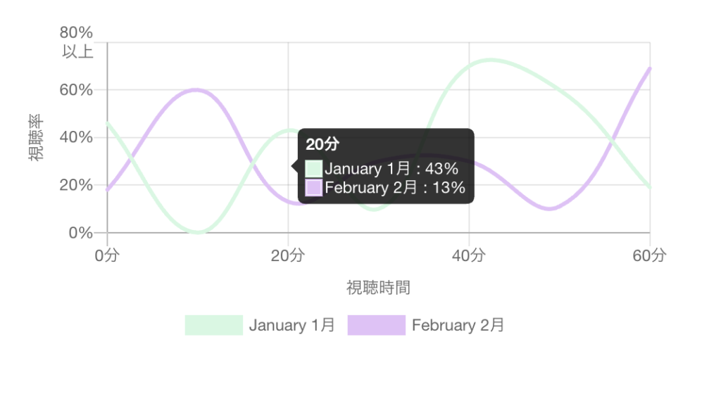
const data = {
  datasets: [
    {
      label: "January 1月",
      fill: false, // ラインの下を塗りつぶす
      backgroundColor: "#d3f8e2",
      borderColor: "#d3f8e2",
      pointRadius: 1,
      pointHoverRadius: 1,
      data: [46, 0, 43, 10, 70, 60, 19],
    },
    {
      label: "February 2月",
      fill: false,
      backgroundColor: "#e4c1f9",
      borderColor: "#e4c1f9",
      pointRadius: 1, // ポイントのサイズ
      pointHoverRadius: 1, // ホバー時のポイントのサイズ
      data: [18, 60, 13, 30, 30, 11, 69],
    },
  ],
  labels: [
    "0分",
    "10分",
    "20分",
    "30分",
    "40分",
    "50分",
    "60分",
  ],
};
options
const options = {
  legend: { display: true, position: "bottom" },
  scales: {
    yAxes: [
      {
        ticks: {
          beginAtZero: true, // 0から開始
          stepSize: 20, // ラベルを20%間隔で表示
          max: 80, // 上限を80%に設定
          callback: (tick) => {
            if (tick === 80) return [tick.toString() + "%", "以上"]; // 80%の場合は、「以上」を付与
            return tick.toString() + "%";
          },
        },
        scaleLabel: {
          // Y軸タイトル
          display: true,
          labelString: "視聴率",
        },
      },
    ],
    xAxes: [
      {
        ticks: {
          stepSize: 20,
          maxTicksLimit: 3, // ラベルの表示数を限定
          maxRotation: 0,
          minRotation: 0,
        },
        scaleLabel: {
          display: true,
          labelString: "視聴時間",
        },
      },
    ],
  },
  tooltips: {
    mode: "x", // X軸に属する値をまとめて表示
    enabled: true,
    intersect: false, // マウスの位置が要素と交差する場合にのみ表示
    callbacks: {
      label: (context, data) => { // January: 84% のように表示
        let label = data.datasets[context.datasetIndex].label || "";
        if (label) label += " : ";
        label += context.value + "%";
        return label;
      },
    },
  },
};
scalesについて
Y軸とX軸の表示設定ができる
ticksで、メモリ幅や上限、下限、表示内容の調整ができる
Y軸の値が80の場合は、サフィックスに「以上」を付与する処理を入れた